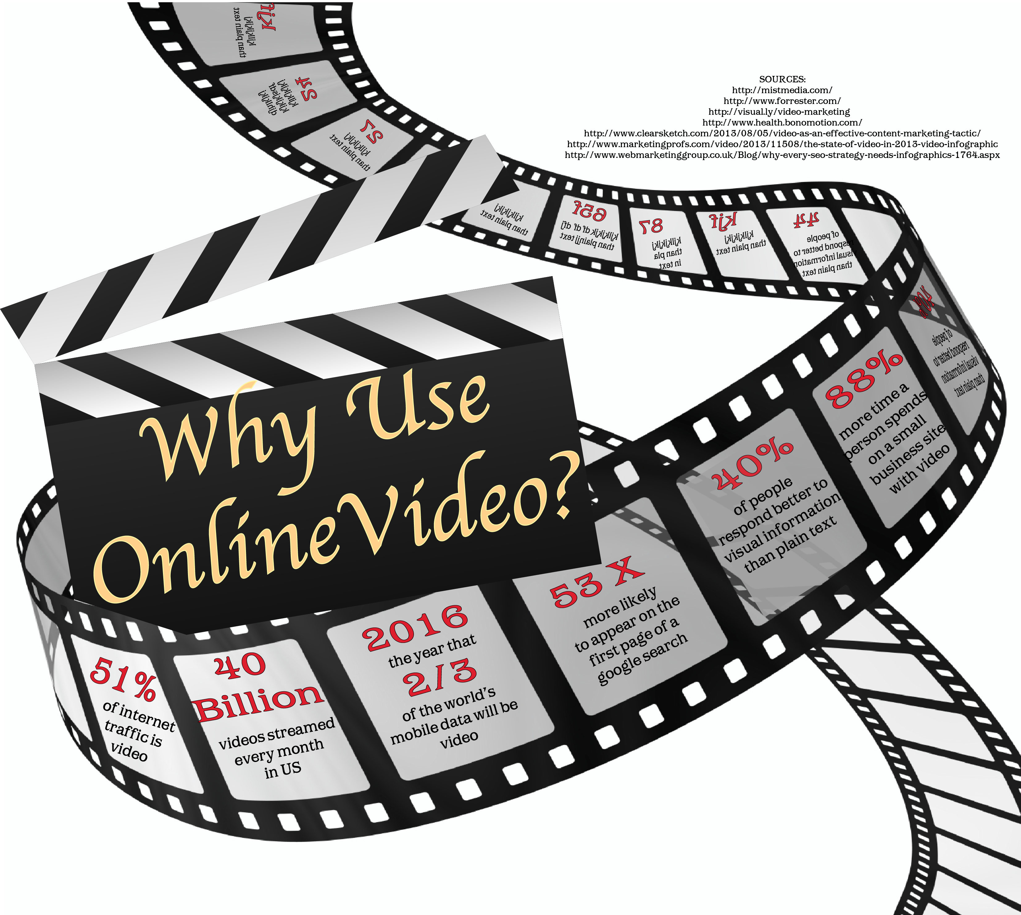
This inforgraphic looks great Toph. I love the correlation between the film strip and video. It is very visual and esthetically pleasing. There is a lot of great information on here as well. I do think that it could be more colorful though.
Chris, this looks great!! I really like the use of film in portraying your message – smart!! The message is very cool, and smart for small business owners. I’ve actually always wondered on this subject. You’ve dispelled the myth!!!
As I mentioned in class, the red font is inconsistent in its use as a heading and a keyword. Otherwise, it’s well done!!!
I think I this infograph was pretty creative and well designed. There is a lot of information and at the same time it does not make you feel overwhelmed. I think most of the critiques we made in class is sufficient enough to help it improve. On other suggestion I thought about in class was how your sources are placed, I think it would look a little more sleek if you could have it fit beneath that triangle shaped area. It would help it close of what white space gap and look more centered. Not necessary, just a thought. Still looks great.
I definitely feel that this is one of the better info graphics from the class. I like the layout and how you incorporated your research and design. I do not know how I feel about having the sources where they are as they are kind of distracting. I like how each piece of the strip has a different fact. The bolded numbers that start each one catch my eyes and are easy to read. The last box however could be hard to read since it has a smaller font and is slanted more. Overall, I really like this one and it gets the message you were trying to convey across.
One thing that really stands out for me with this infographic was the way you incorporated the film reel with the text. It’s not like your typical infographic and I like that about it. I would agree with Jacob that the sources is in an awkward place, however other than that, it looks great.
Good job team video. From first glance I love the layout. I personally like the black and white look. I think it shows that on-line video is the next greatest thing but also gives the feel of old time videos. I do agree with what we mentioned in class, the writing is a little small and confusing but all and all it looks great.
Nice infographic! I like that the theme represents what you are discussing! The only thing that I would suggest is trying to find someway to fill in the blank spaces towards the top and bottom of the page!

This inforgraphic looks great Toph. I love the correlation between the film strip and video. It is very visual and esthetically pleasing. There is a lot of great information on here as well. I do think that it could be more colorful though.
Enjoyed the way you used statistics to show how often video is used.
It could use more colors and bigger font for the information.
Chris, this looks great!! I really like the use of film in portraying your message – smart!! The message is very cool, and smart for small business owners. I’ve actually always wondered on this subject. You’ve dispelled the myth!!!
As I mentioned in class, the red font is inconsistent in its use as a heading and a keyword. Otherwise, it’s well done!!!
I think I this infograph was pretty creative and well designed. There is a lot of information and at the same time it does not make you feel overwhelmed. I think most of the critiques we made in class is sufficient enough to help it improve. On other suggestion I thought about in class was how your sources are placed, I think it would look a little more sleek if you could have it fit beneath that triangle shaped area. It would help it close of what white space gap and look more centered. Not necessary, just a thought. Still looks great.
I definitely feel that this is one of the better info graphics from the class. I like the layout and how you incorporated your research and design. I do not know how I feel about having the sources where they are as they are kind of distracting. I like how each piece of the strip has a different fact. The bolded numbers that start each one catch my eyes and are easy to read. The last box however could be hard to read since it has a smaller font and is slanted more. Overall, I really like this one and it gets the message you were trying to convey across.
One thing that really stands out for me with this infographic was the way you incorporated the film reel with the text. It’s not like your typical infographic and I like that about it. I would agree with Jacob that the sources is in an awkward place, however other than that, it looks great.
Good job team video. From first glance I love the layout. I personally like the black and white look. I think it shows that on-line video is the next greatest thing but also gives the feel of old time videos. I do agree with what we mentioned in class, the writing is a little small and confusing but all and all it looks great.
Nice infographic! I like that the theme represents what you are discussing! The only thing that I would suggest is trying to find someway to fill in the blank spaces towards the top and bottom of the page!